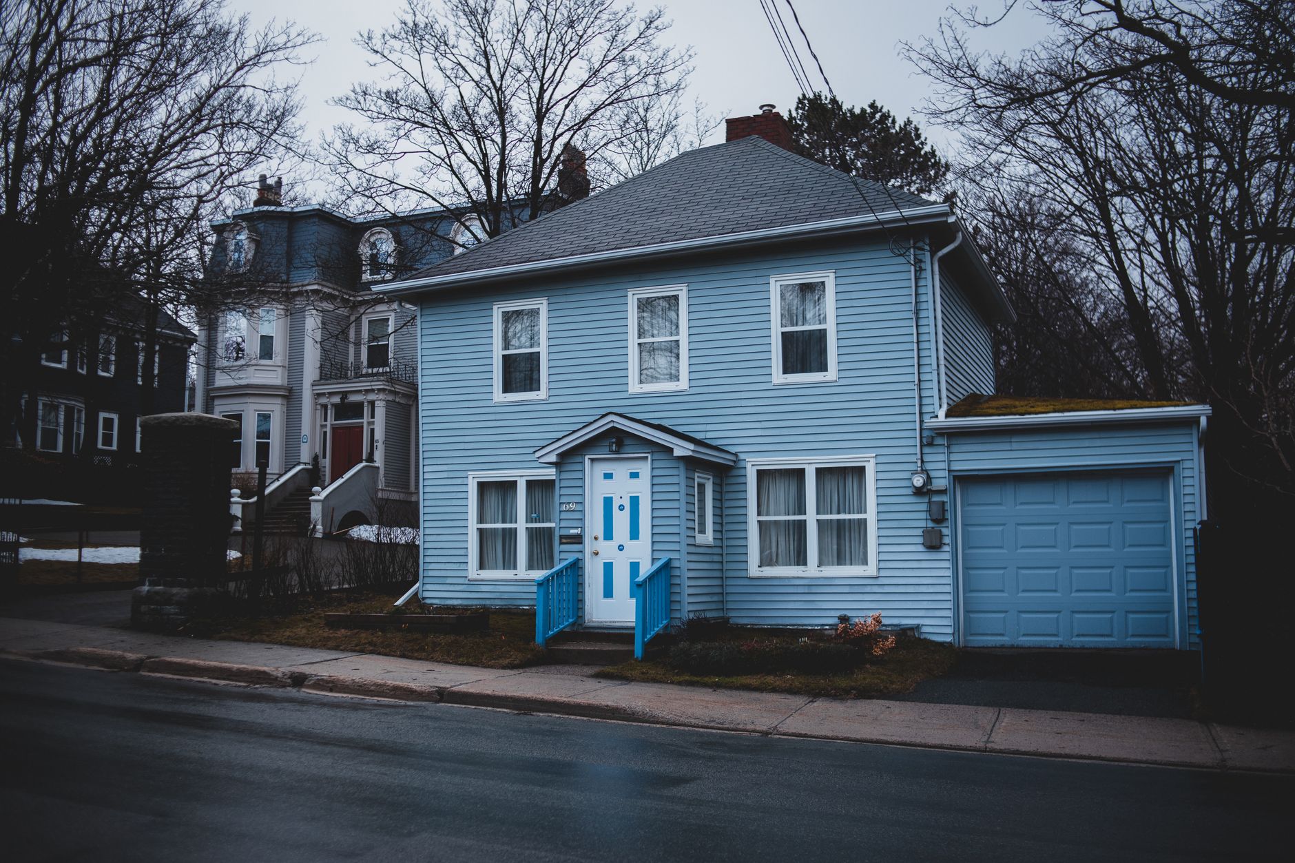
Understanding Blue Exterior Paint Shades
Warm vs. Cool Blues
Choosing the right shade of blue starts with understanding the difference between warm and cool tones. Warm blues often have subtle hints of green or gray, lending a cozy and inviting feel to your home’s exterior. Cool blues, on the other hand, lean toward crisp, icy, or navy hues that can create a more modern or serene atmosphere. Deciding between warm and cool shades depends on the mood you want your home to convey and how it interacts with natural light throughout the day.
Popular Blue Tones for Homes
Some blue tones have become favorites for exterior house paint because of their versatility and timeless appeal. Classic navy blue offers a bold, traditional look, while powder blue or sky blue provides a soft, airy vibe. Slate blue and steel blue incorporate gray undertones, adding sophistication and subtlety. Coastal-inspired homes often embrace muted or pastel blues, whereas cottages or historic houses might benefit from deeper, richer blues that highlight architectural details.
How Lighting Affects Blue Paint
Lighting plays a crucial role in how blue paint appears on your home’s exterior. Natural sunlight can make blues look brighter and more vibrant, while shaded areas or cloudy days can mute the color. Artificial lighting at night may introduce warmth or coolness depending on the bulb type. It’s important to observe your chosen blue shade at different times and lighting conditions to ensure it complements the house and surroundings consistently.
Assessing Your Home’s Style and Surroundings
Architectural Styles That Suit Blue
Blue exterior paint works beautifully with a range of architectural styles. Traditional Colonial, Cape Cod, and Craftsman homes often look stunning with navy or muted blue shades. Modern or contemporary homes can benefit from brighter or cooler blues that emphasize clean lines. Meanwhile, coastal and beach-style houses naturally pair with soft, weathered blues that evoke the ocean. Matching the blue tone to your home’s style enhances its character and curb appeal.
Neighborhood Color Considerations
When selecting blue exterior paint, consider the color palette of your neighborhood. If many homes are painted in earth tones or neutrals, a bold blue can make your house stand out, but it should still harmonize with nearby properties to maintain overall cohesion. In neighborhoods with vibrant colors, choosing a more subdued or classic blue can create a sophisticated balance. Checking local homeowner association guidelines may also provide useful color recommendations.
Landscape and Environment Impact
The natural environment surrounding your home influences how blue paint will look. Homes near lush greenery benefit from blues with greenish undertones, blending seamlessly with the landscape. Conversely, houses in arid or desert areas might be better suited to cooler or grayer blues to contrast the warm earth tones. Coastal environments often inspire light, airy blues that reflect the sky and sea. Understanding these interactions helps your blue paint feel connected to its setting.
Choosing the Right Finish for Durability and Appearance
Matte, Satin, or Gloss: What Works Best?
Exterior paint finish affects both the look and longevity of your blue paint. Matte finishes offer a smooth, subtle appearance that can hide imperfections but may be less durable against weather. Satin finishes provide a gentle sheen that balances aesthetics and durability, making them a popular choice for most exteriors. Gloss finishes reflect more light, highlighting architectural details but can also show flaws more easily. Selecting the right finish depends on your priorities for appearance and maintenance.
Weather Resistance and Maintenance
Blue exterior paint must withstand varying weather conditions, from intense sunlight to heavy rain or humidity. Look for paints labeled as weather-resistant or formulated for exterior use with UV protection. Higher-quality paints retain their color longer and resist fading, chalking, or peeling. Maintenance is easier with finishes that can be cleaned without damage. Regular inspection and touch-ups help keep your blue exterior looking fresh for years.
Matching Finish to Home Features
Consider how the paint finish complements your home’s architectural features. For example, a satin finish works well on smooth siding, while a matte finish might suit textured surfaces like stucco. Glossy finishes can highlight trims, doors, and shutters, creating contrast that enhances appeal. Aligning the finish with both your blue shade and the home’s materials ensures a cohesive and polished look.
Pairing Blue with Complementary Colors
Trim and Accent Color Ideas
Choosing trim colors that complement your blue exterior is key to a harmonious facade. Crisp white trim is a classic pairing that brightens and defines blue walls. Light grays and soft creams can offer subtle contrast without overpowering the main color. For a more dramatic effect, darker shades like charcoal or navy trims deepen the palette and add dimension.
Door and Shutter Color Suggestions
Doors and shutters are perfect places to introduce accent colors that enhance your blue exterior. Bold reds, sunny yellows, or vibrant oranges create lively contrasts that draw attention to entry points. For a more understated look, deep greens, black, or metallics like bronze or copper can add elegance without competing with the blue. Consider the style of your home and surrounding landscape when selecting these accent colors.